So, how to make your users involved enough with your app to make them want to use it?
1. Google Play/ App Store.
After you launched your mobile app, you can promote it in many places, but finally, people will download it from Google Play or App Store. The first thing people see in stores are the app name and icon. Take care of the name’s meaning and icon design. Both the icon and the name should be consistent with the app’s purpose.
Prepare the best of your screenshots. People will check the screenshots before they download the the app. Make sure the description of your app sounds interesting. Explain what your app does and why people should download your app rather than something else.
2. The splash screen.
Your logo should be the main the element on your splash screen. It helps users recognize the brand. If you want to make your splash screen more eye-catching, you can add some graphic elements consistent with your brand. Don’t overwhelm users with too many elements and information. Find the best color scheme that matches the logo.
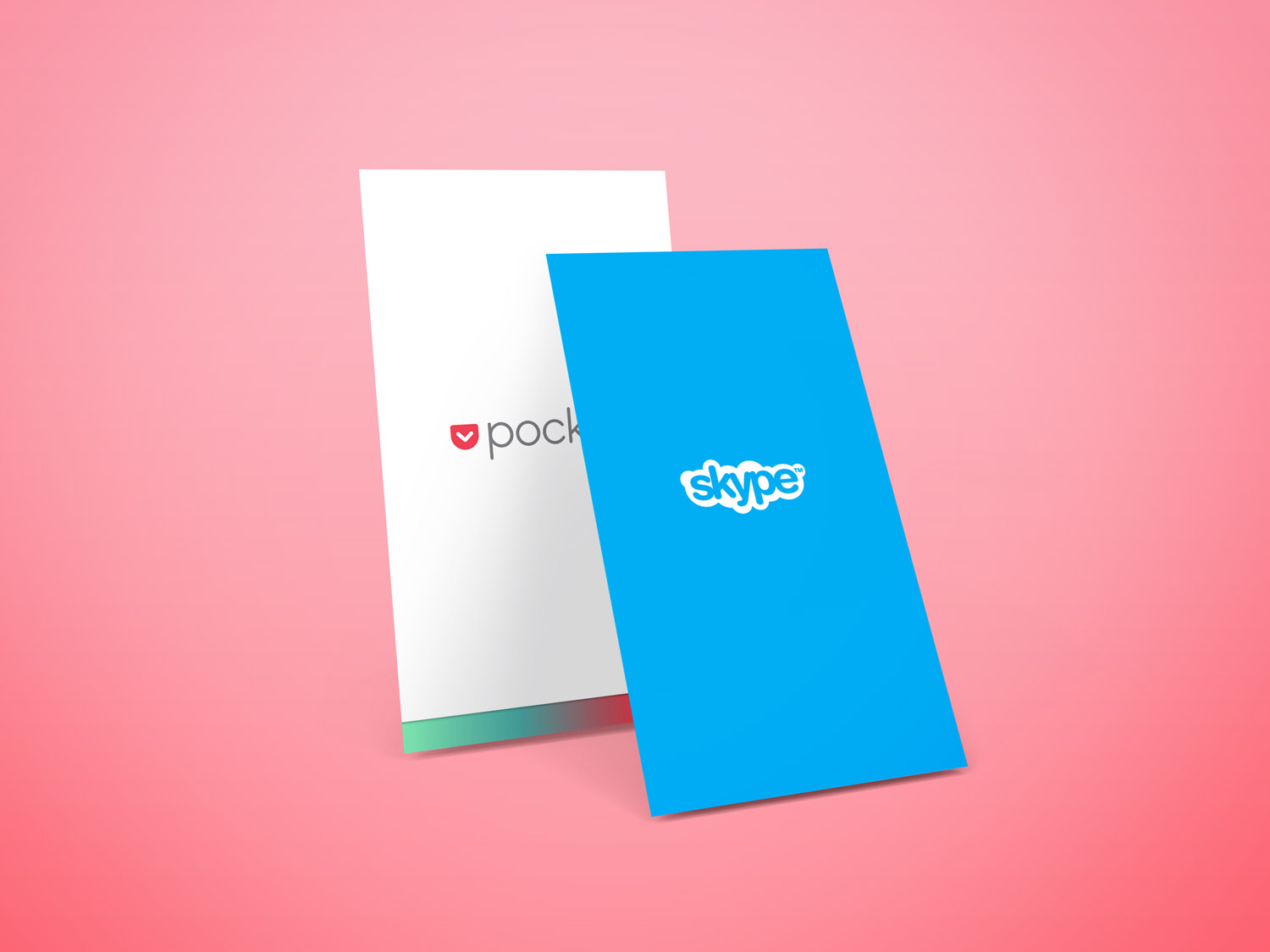
Pocket and Skype splash screens
3. Login/Sign up screens.
Login/Sign up screen should give an option to signing in and create a new account. Remember to add the „Forgot Password” option on the login screen. Consider the possibility to login with preexisting account credentials from Google, Twitter or Facebook. Social media logins help make the login process quicker.
4. Onboarding.
Onboarding is the best way to introduce new users to the application. You can use onboarding to teach about features and explain how the app works. It is a good place to inform about the value that app offers to the user .
There are a few common onboarding user patterns:
The value onboarding – introduce what an app does to a user. For example, you can create swipe-through screens with static graphics or animations, which explain what benefits arise from the use of applications that people can get.
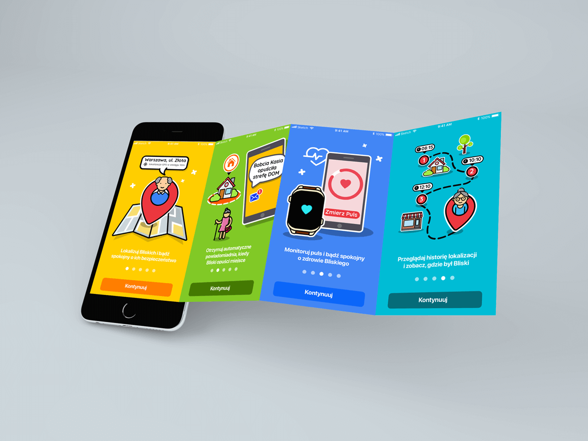
Example of onboarding – swipe-through screens
Function onboarding – guide the user through the app and show how to use the app’s essential functions.
Progressive onboarding – let people discover the app by themselves and give them the most important information when using the application.
Be sure you allow people to turn onboarding off if they want (and of course turn it on back in the future when they get stuck).
5. Design an empty state.
If the first time when people use your app and it shows a lot of blank places, they can get confused. Without any guidance probably they are likely to miss out an opportunity to explore your app. Prepare well looking empty screens which explain empty elements of the UI and help people quickly learn how to use your app.
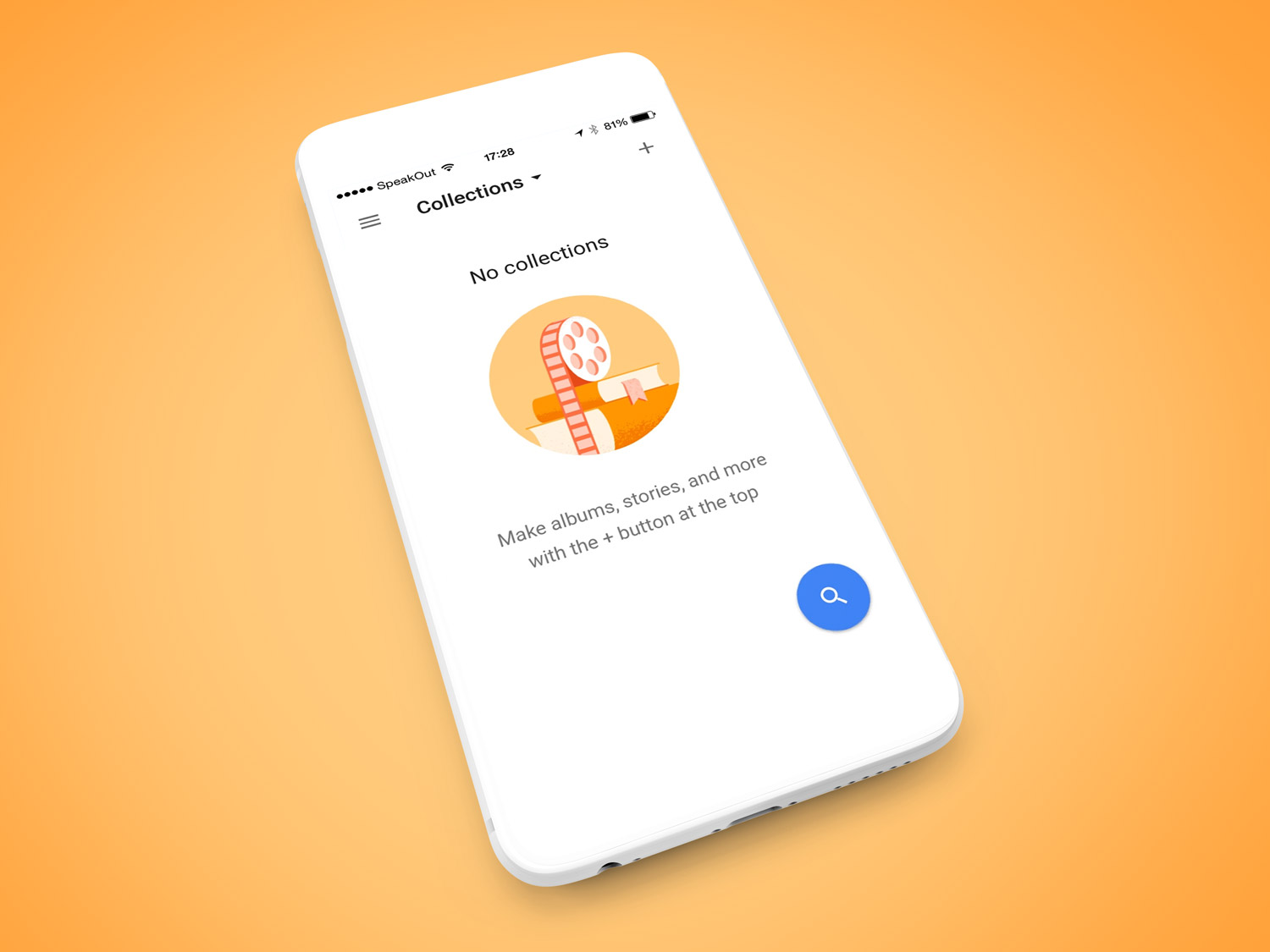
Empty state from Google Images for iOS
6. Try before you buy.
Give people what they came for as fast as it is possible. Don’t force users to pay before they have an opportunity to check the app’s main features. Nobody wants to pay for the app that they couldn’t even try out. It is popular to give a trial period, which grants the users access to full app’s functionality. You can also give users only a few free features and encourage them to pay to get more.
Getting the users install and get involved with the app is really hard work. Try to educate people about the value of your app as soon as possible. Help them quickly become an advance user of your product and don’t force them to pay at the very early stage of using your app. Add some nice looking element to draw people’s attention.
I hope you found this useful!